

Telling better stories with data
/Marketing is often storytelling, even (or especially) when you’re marketing sophisticated services with lots of data and probability supporting your claims.
And if your charts, graphics, tables, and other data visualizations aren’t telling the story, you’re wasting time and pixels.
For example, pie charts are notoriously misused by marketers. And although analytical types love to use scatter plots, even some college graduates have a difficult time comprehending them.
Well, it’s the designers’ job to make sure visuals are carrying their storytelling weight, right? Right—in that perfect world that doesn’t exist. Most designers are overworked, concerned about following brand standards, and, to be fair, are very focused on making a given visual look as good as it can.
They’re typically not thinking about the larger question: is this even the right visualization for the job? Are we trying to tell a story with a pie chart that would be better told with bar charts or something else?
So the onus is on you, the marketer.
Does that mean you need to read all of Edward Tufte’s books? Not necessarily (although it wouldn’t kill you). There’s a quicker way to get better at data visualization.
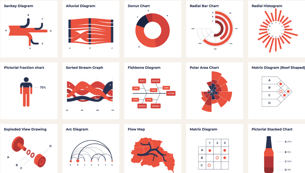
Ferdio’s Data Viz Project
Several online tools can help you learn—or, if you don’t have time to learn, to immediately start giving better direction to your design team.
We like two in particular. Ferdio’s Data Viz Project doubles as a field guide to over 150 visualization types and a practical tool for choosing the most effective visualization for the job at hand. Its interface lets you experiment and explore. For each visual type, there are real-world examples that can get you and your designers thinking more creatively about how to execute.
Juice Analytics’ Chart Chooser provides a quick decision tree, driven by your objective, that narrows your choice down to the most effective graphic and helpfully provides downloadable chart templates in .xlxx and .pptx formats.
If you catch the data viz bug and want to get into the weeds, one place to start is Junk Charts, where information designers go deep into what works and what doesn’t.